Product design | Onepay Finplan
Design for finance
A personal finance app for improving money habits through leveraging stats of income, spending, and financial goals.
The product
A personal finance app
for better money habits.
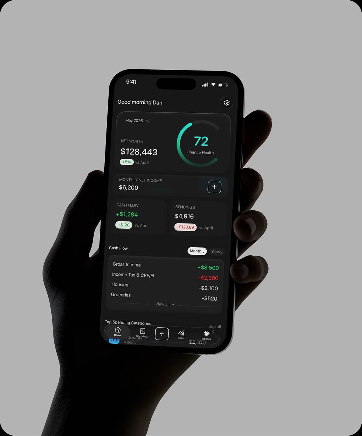
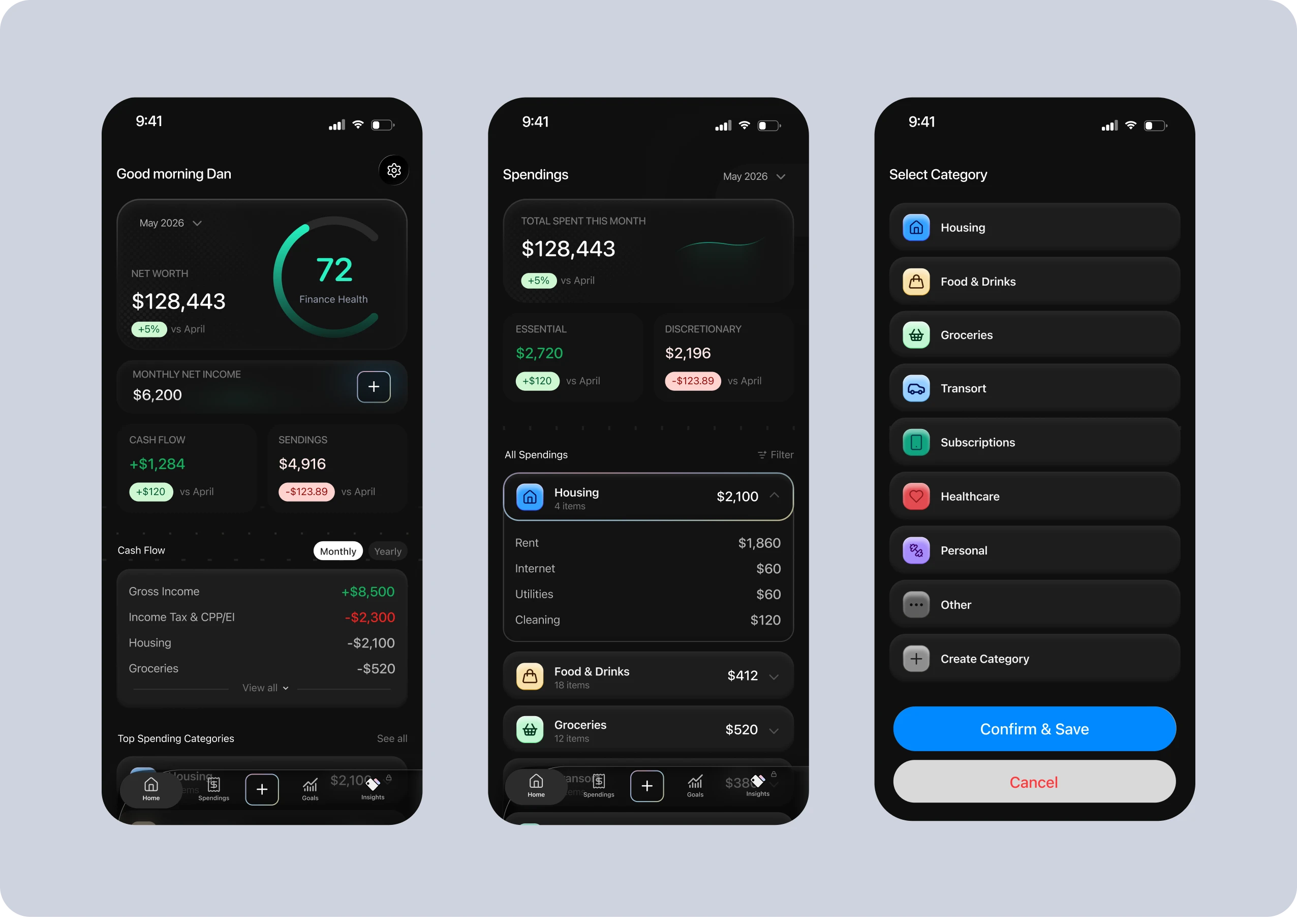
OnePay Finplan stays current with your financial spendings, stacks your money habits against official money spending standards, and shows you how much you can set aside to reach your financial goals.
The core tension
Every financial plan starts with a static form that doesn't evolve into a habit.
As the first step of planning, clients are often asked to fill out a paper form that reconstructs years of financial life: income, assets, debt, spending and goals, all sorted into roughly 1,000 fillable fields across categories like Housing, Transportation, Childcare, Personal Grooming, Savings & Investments.
Clients can take days to weeks to complete it. Once done, the result is a single event on a piece of paper, filled out once and never looked at again. Advisors watch clients drift back to old habits within months of meeting them. The form does not stick into a habit.
Objectives for OnePay
Track
A financial tracking system that falls in line with the financial advisor form.
Evolve
Make the tracking statistics evolve with day-to-day habits, not a one-time capture like a form.
Form habits
Put the two together to help users form habits that improve their financial health.
What I worked from
A combination of advisory insights and tools, user research and competitor analysis.
A working financial advisor partner
A working professional in the field who helped identify the core project issue and how we could design a solution within regulations and guidelines.
Real income to spending benchmarks
Real financial benchmarks and categories according to Canadian regulatory guidelines and CFP practitioner standards, used for OnePay's calculations and assessment of financial health.
Competitive analysis of top budget apps
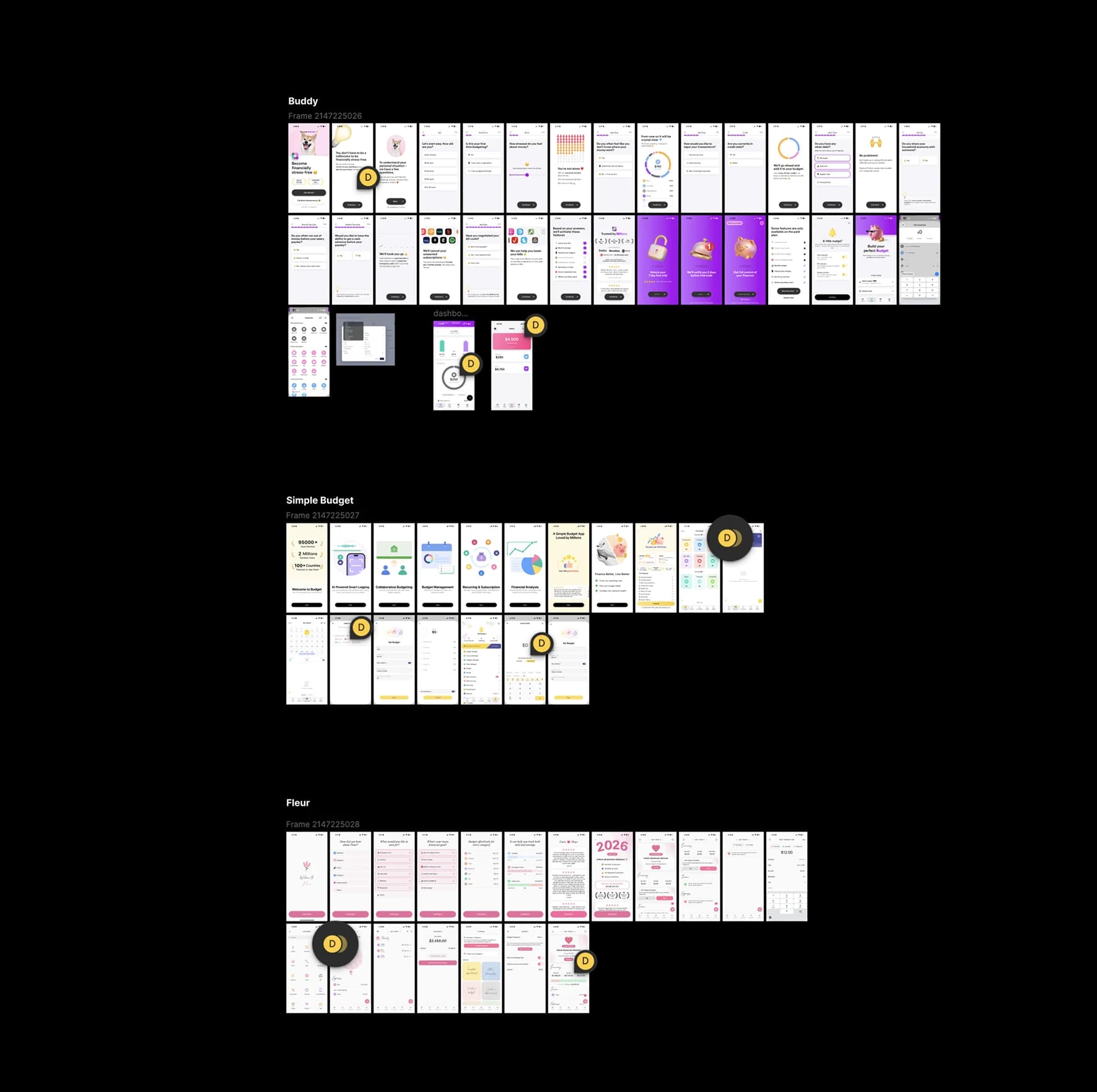
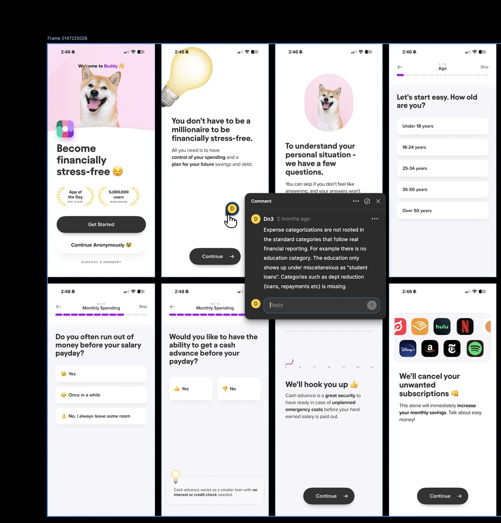
A deep teardown of Buddy, Simple Budget and Fleur: mapping their core flows to see how they shaped their products, and finding weaknesses OnePay could tackle.
Key decision 01
Make expense logging
feel effortless
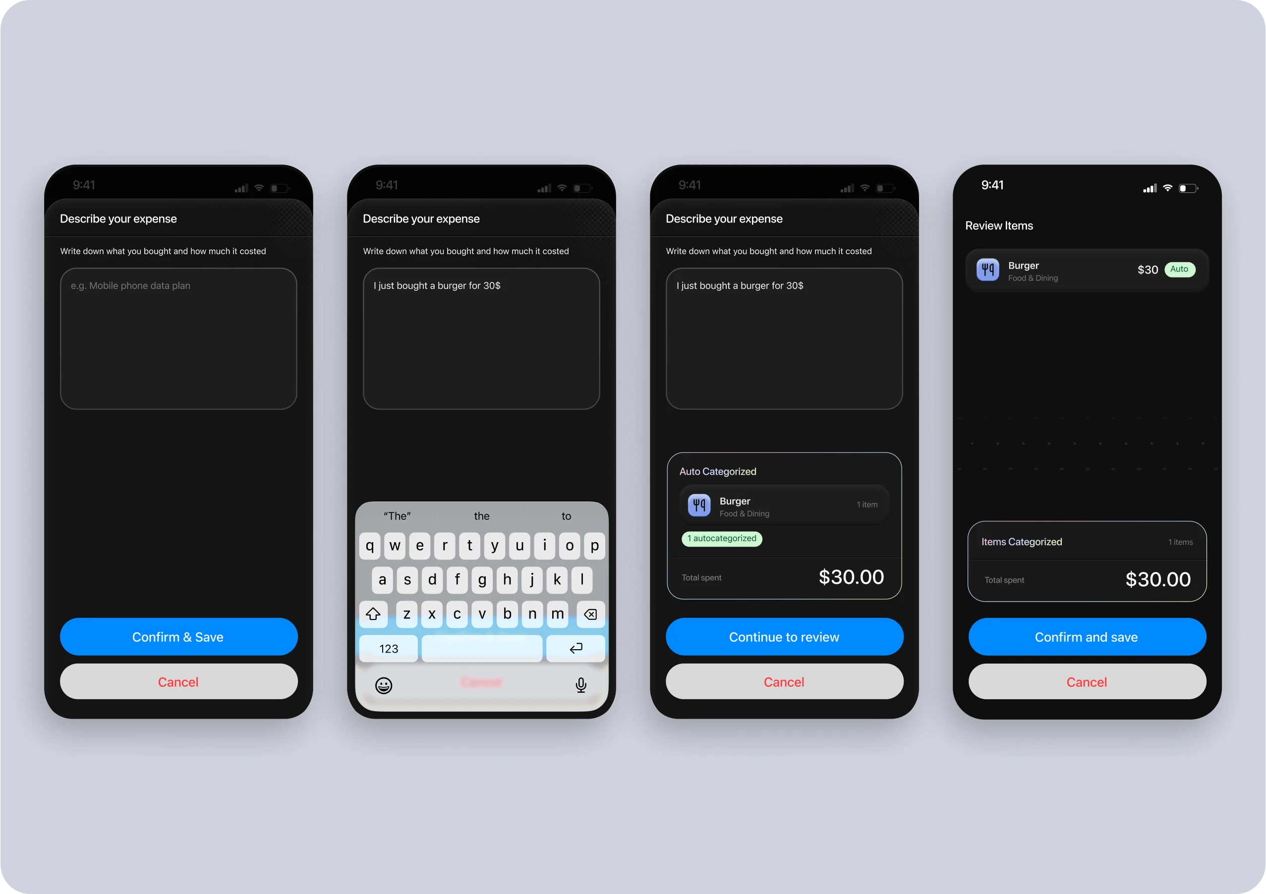
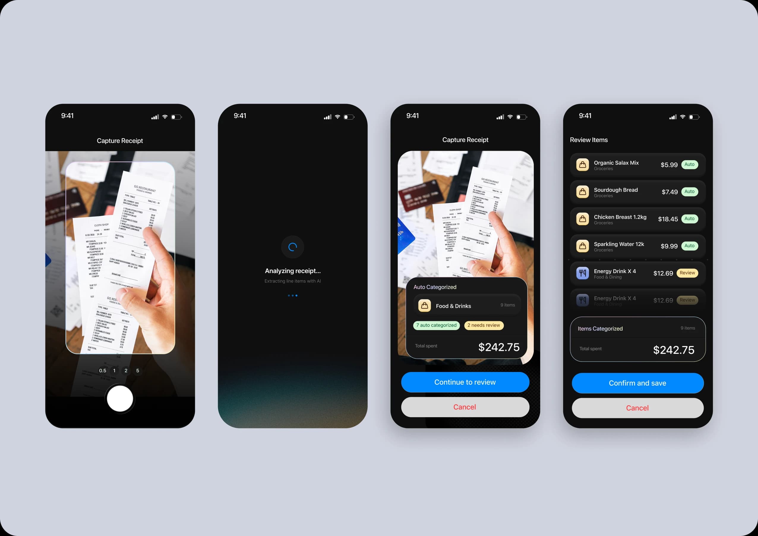
I came up with two easy ways to log expenses that fall in line with regulations.
Speaking
Describe an expense in a sentence like: “I just bought a burger for $30”. The app categorizes it and presents it to you ready to confirm.
Scanning
Taking a picture of a receipt or statement lets the app analyze and categorize all items, ready for your review.
Key decision 02
Measuring against
national standards
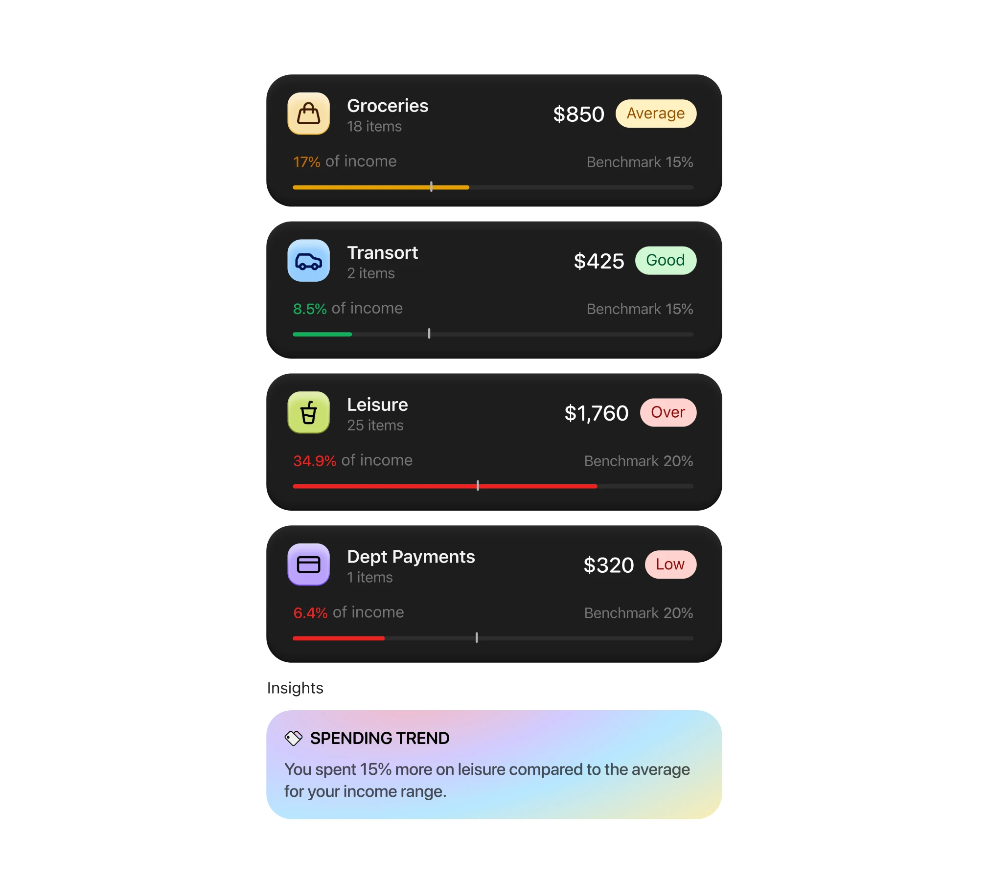
Competitor apps (Buddy, Simple Budget, and Fleur) all ask users to set budgets per spending category up front before using the app. They assume the user already knows how much they should spend, which is precisely the knowledge the user probably doesn't have.
All competitor apps used their own categorizations for expenses, finances etc. As a result, each had their own dedicated metric system which was only useful within their own app.
Benefits of using national standards:
Real financial insights
By being compared to national standards, calculations about actual financial health are accurate and rooted in real data.
Usable financial reports
Since we use real formulas and statistics, we can generate reports that your financial advisor can use to help you improve further.
Key decision 03
Incorporating goals
and a real path to get there
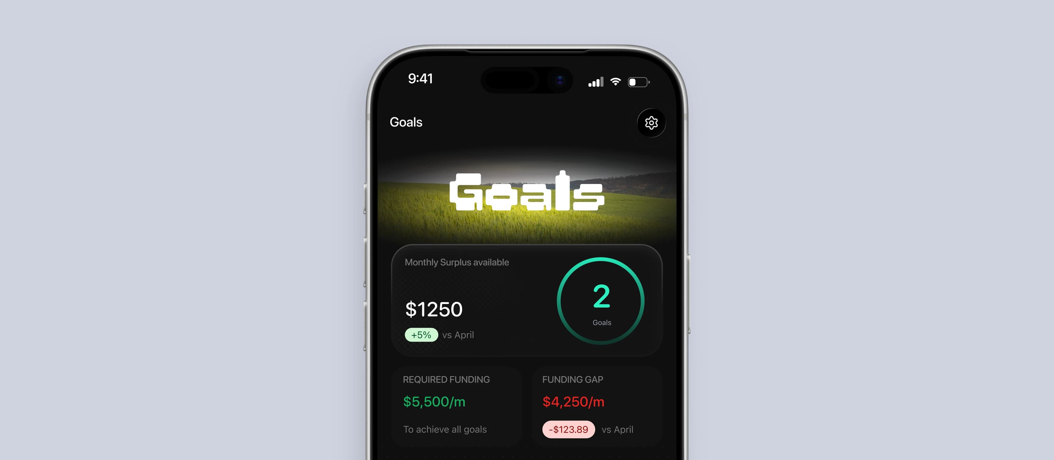
It's easy for someone to say they want to buy a house, a car or a big purchase. People rarely do the calculations that take you there.
Using our calculations for financial health, we incorporate goal setting within the statistics to help users understand how much monthly contribution it takes to achieve those goals. This is a common step in professional financial advising.
Where I failed
Designing solutions
before checking regulations
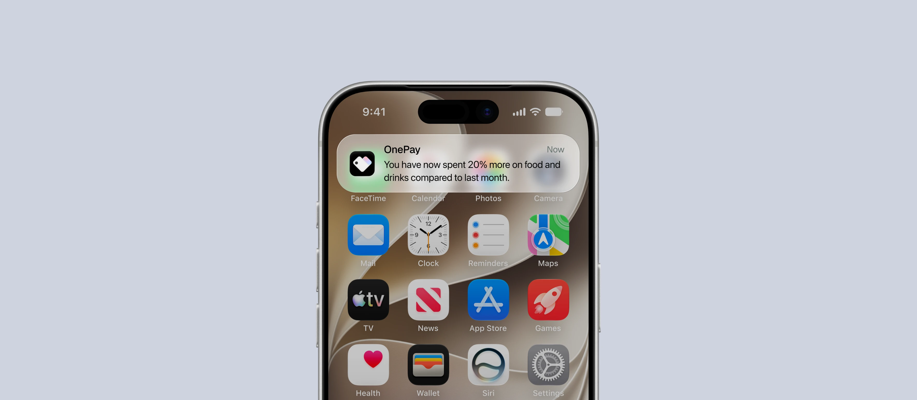
Initially, I designed the app to connect directly to Apple's wallet app to track expenses. The idea was based on the app only visually keeping track of spendings and auto categorizing them as the user spends during day to day living.
After spending time designing around this mechanism, we discovered the app store's guidelines are tight and access to Apple's iOS wallet app would be nearly impossible. We had to quickly rethink how to change our app to fit this constraint.