Web design | Chekkit2025 – ongoing
Web design for SaaS
Project brief
Designing for product clarity
Introduction and core problem
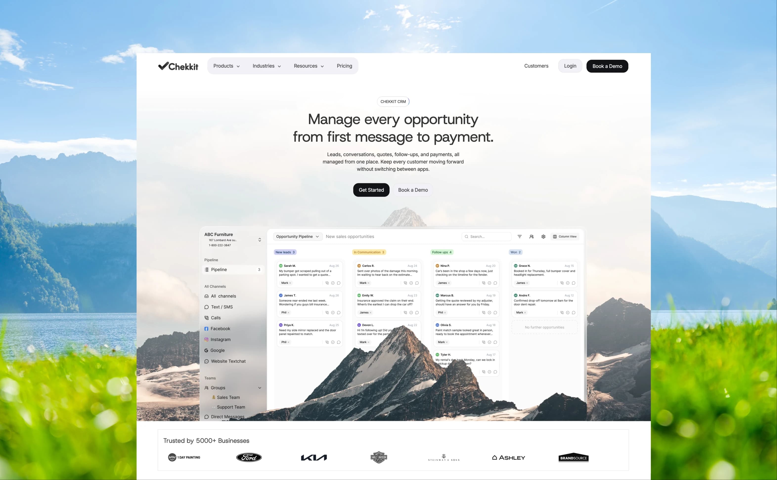
Chekkit is a business messaging platform with around 11 features in one software. Its website previously tried to show all 11 features at once, resulting in a confusing page without a core leading proposition. Many users reported not even knowing Chekkit had a new AI feature, which was a core new development for Chekkit.
In this project, I rebuilt the entire website around 4 core features with a focus on hierarchy of what to include and what to demote for an overall lighter, more cohesive website experience.
What I did
- Full website revamp leading to increased 30 new customer sign ups per month
- New storytelling led to increased sign ups of AI focused package
- New web design system that can be followed across all future pages
- Custom UI animations for better storytelling
Key decision 1
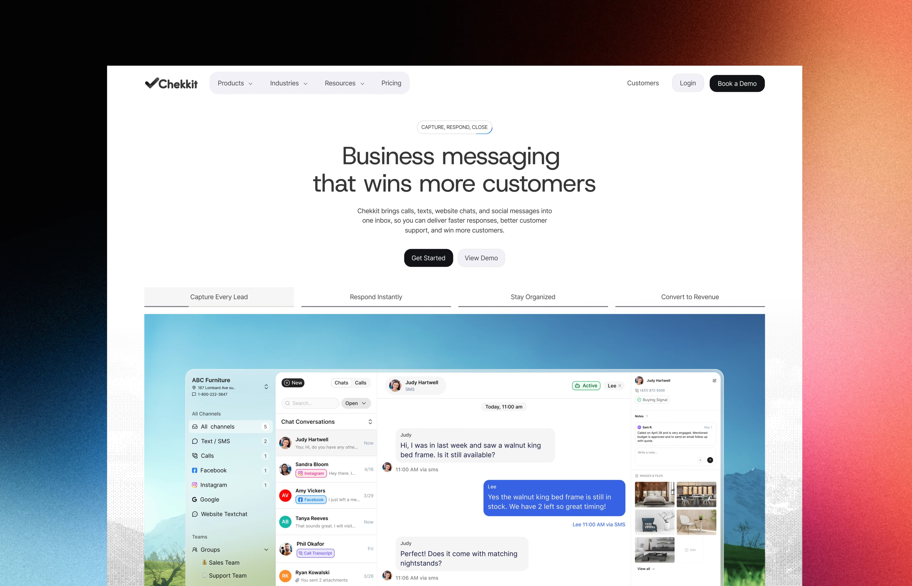
Positioning Chekkit's core value as “Business Messaging”
Improvements to information structure
Visitors should quickly land on “business messaging” as the core feature
Visitors should understand how Chekkit can help them succeed
Key decision 2
Changing hierarchy
without deleting anything
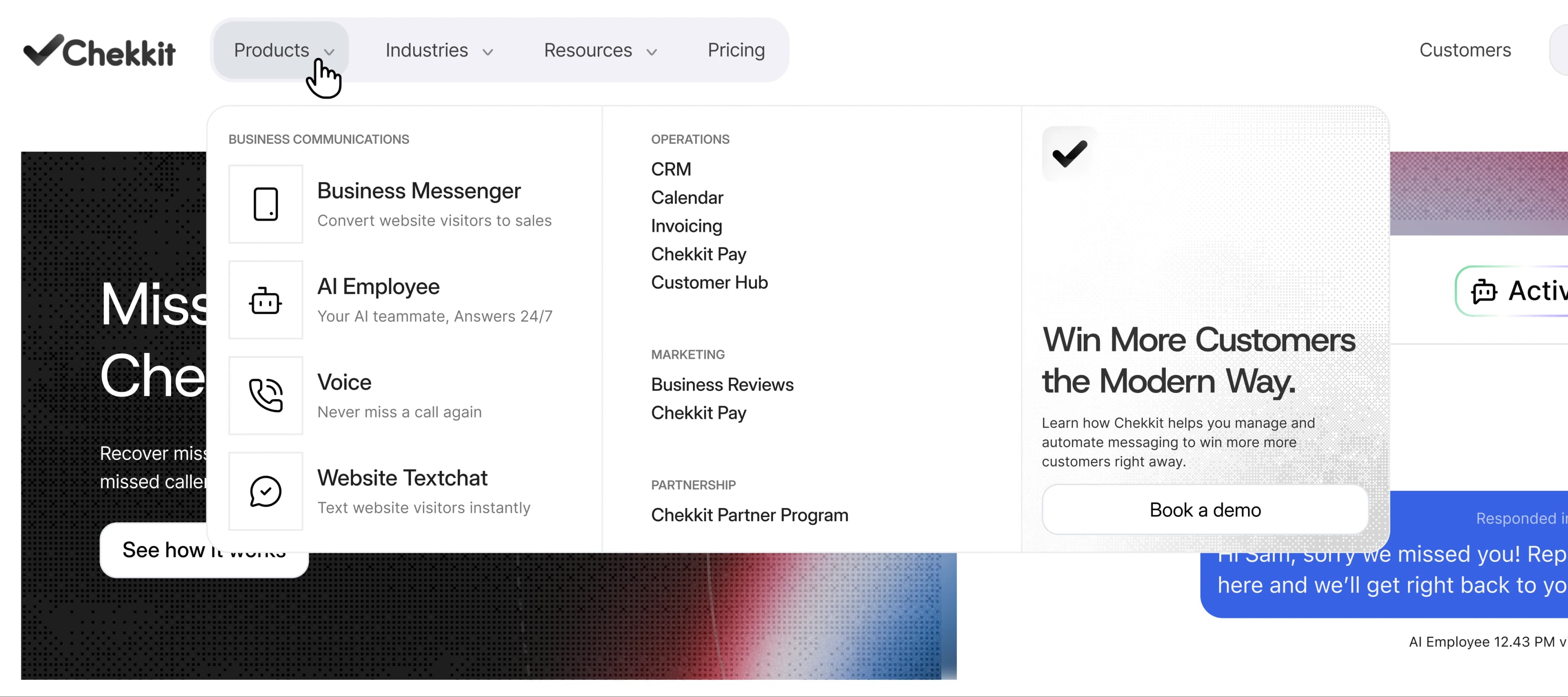
We still wanted to keep access to the entire suite of features Chekkit offered, however with favourability towards the core features that brought them and their customers the most results.
We did this through grouping complementary features under “operations” and “marketing” through a list within the navigation. For the core features, they were made more prominent under their own “business communications” column.
Motion
Animations that show features
faster than text
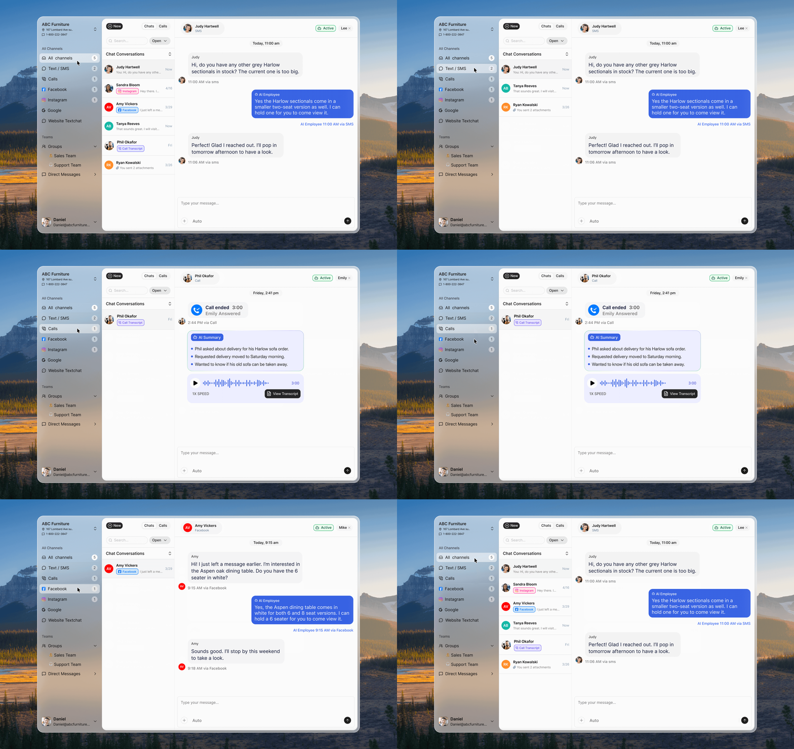
I worked on UI animations to show the product working visually to give users the look and feel of using Chekkit. Many of the animations communicate messaging that comes across better visually rather than showing text.
These animations breathed life throughout the site and gave users better scanning to understand Chekkit rather than investing time reading the texts.
Animation 1
Freeing up
team time
This animation illustrates the idea of Chekkit AI resolving inquiries on its own, hence why we don't see the messages themselves. We only see the AI running in the background and solving the inquiry.

Animation 2
Getting calls
through Chekkit
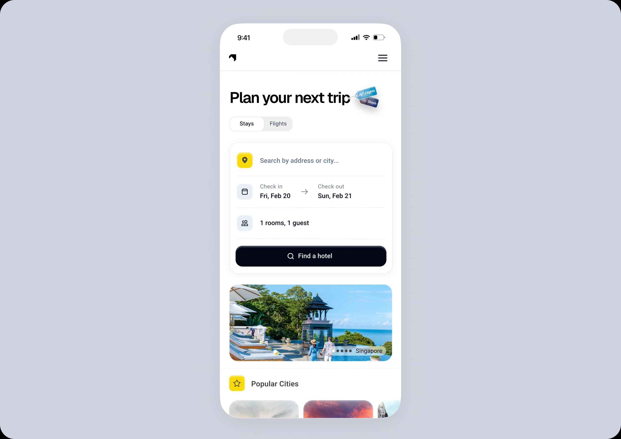
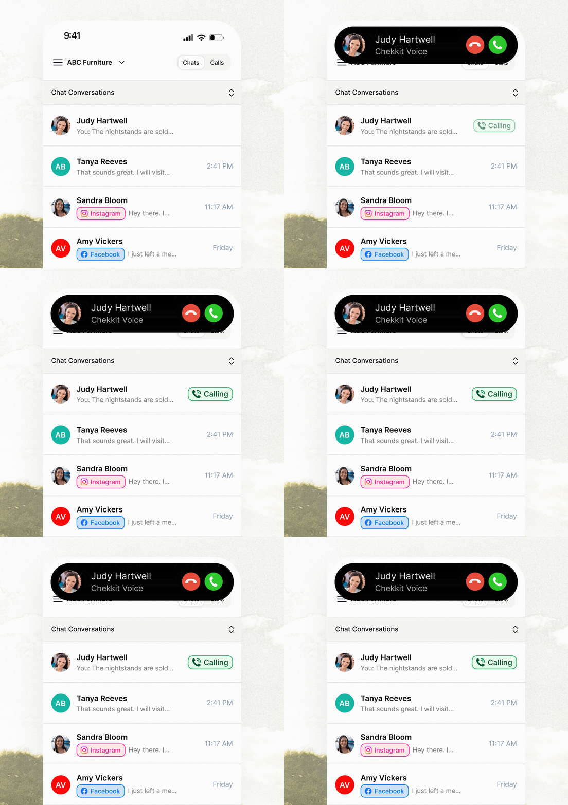
This animation uses a familiar iOS call interface to show how Chekkit falls right into familiar situations by working with your native OS.
Animation 3
A shared inbox
made literal
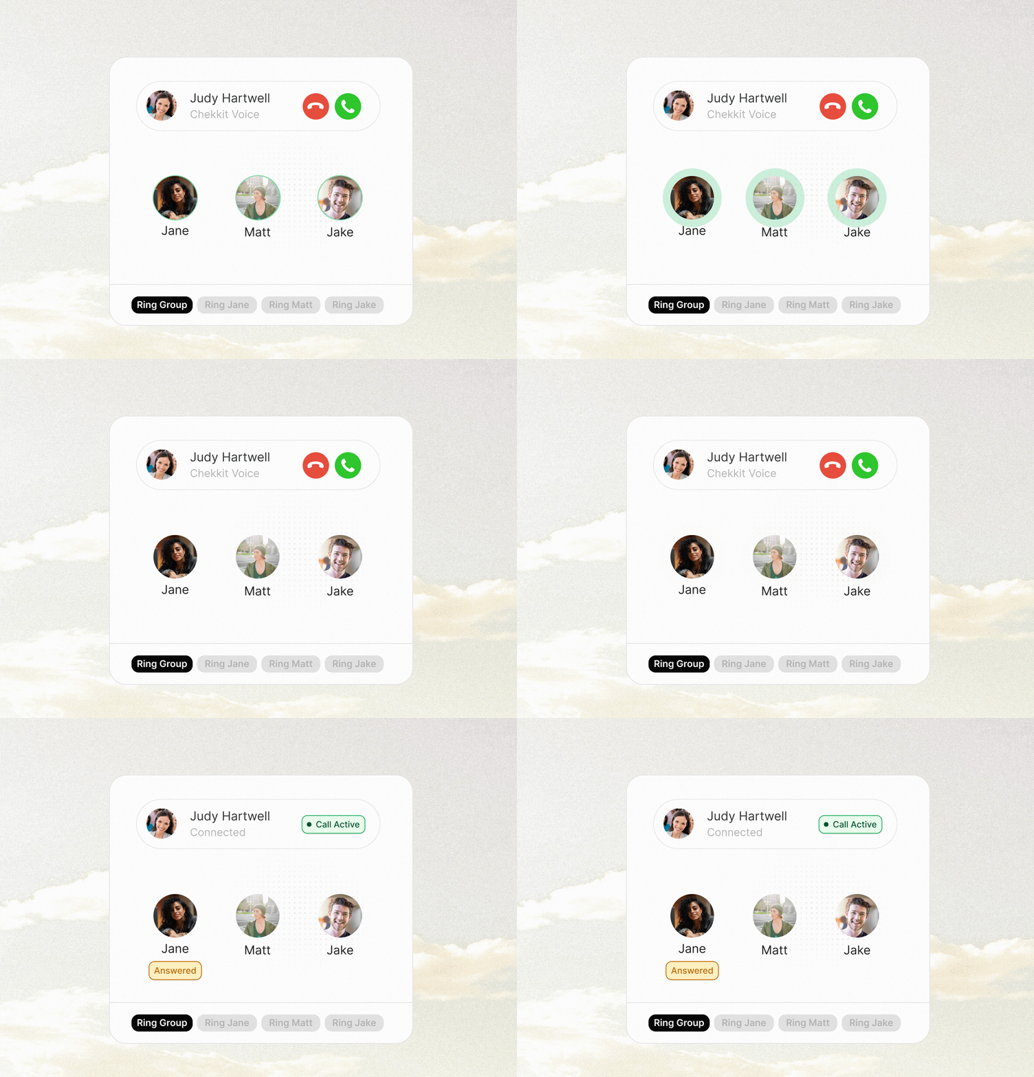
This animation illustrates the nature of a shared inbox. We have a call come in, multiple team members are notified, and one member picks up.
Animation 4
Omnichannel
communication
This animation cycles through the various inboxes in a single dashboard to show how all messaging can be handled without constantly switching between apps.