Product design | Staynex
Design for travel
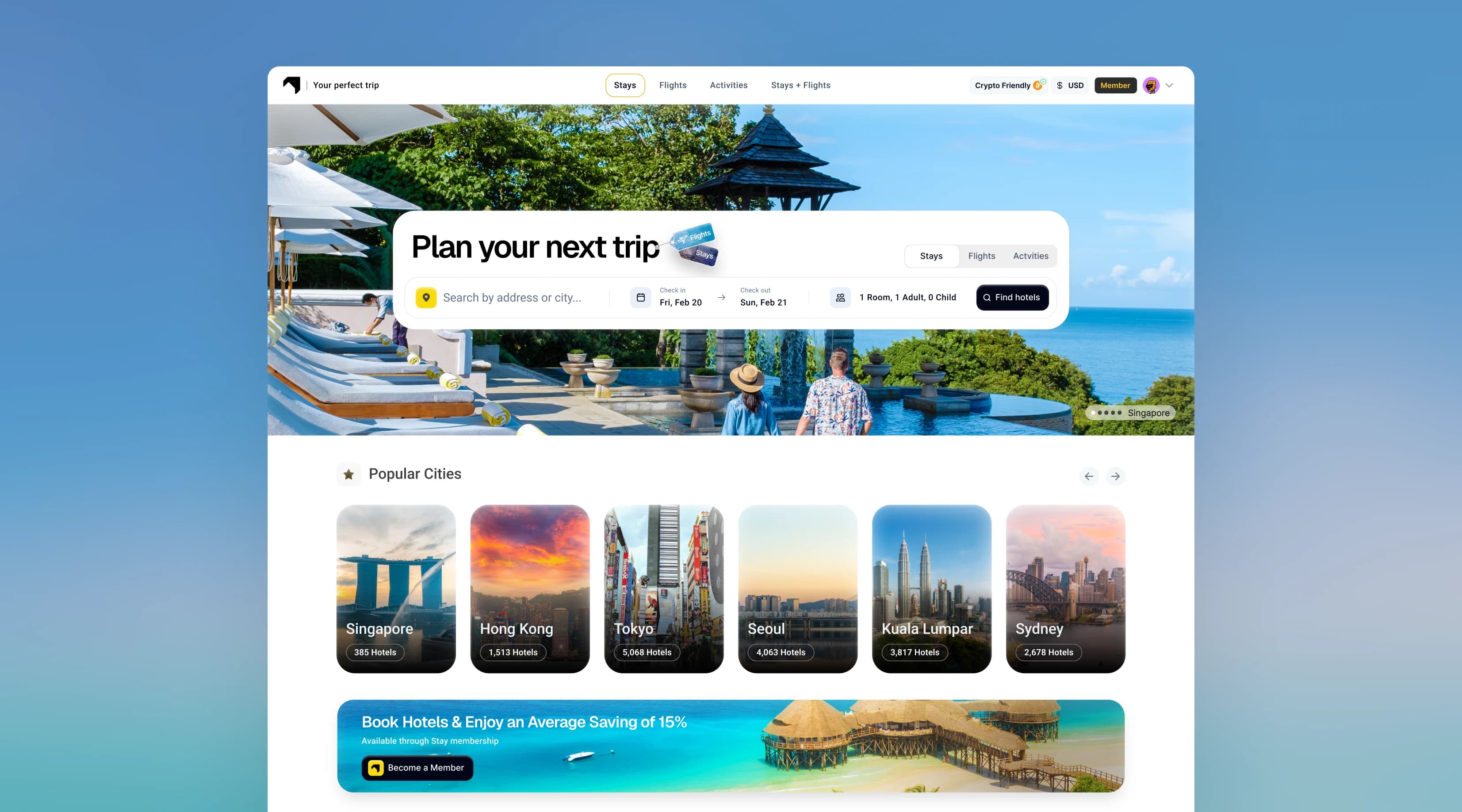
End-to-end redesign of hotel booking platform to one that feels on par with other booking giants but also incorporates a subscription model that brings travel benefits.
The product
A booking platform
with a membership at its core
Introduction and core problems
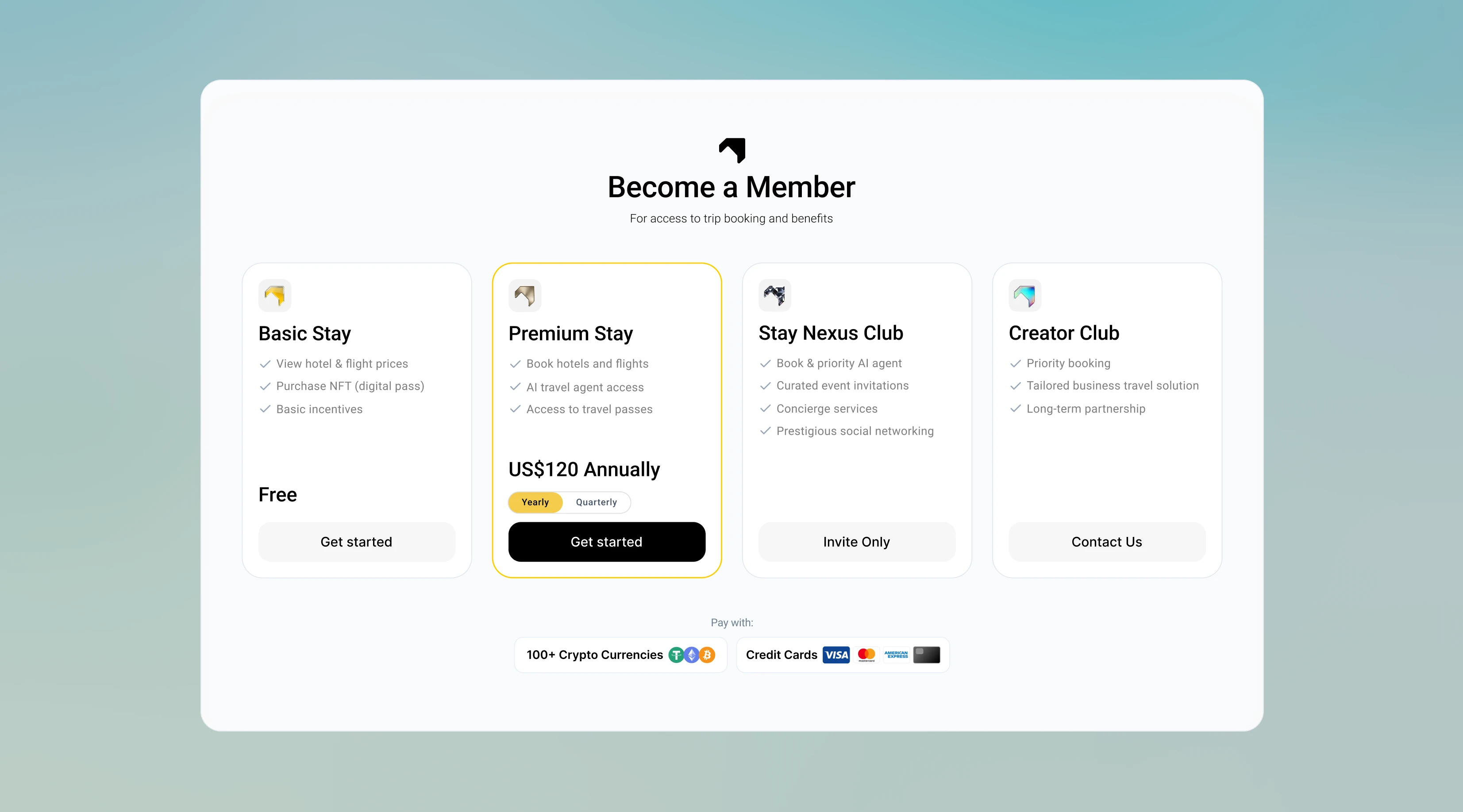
Staynex is a travel agency based on a subscription model. For a yearly fee, members get access to zero-markup pricing on hotels, flights and experiences while earning tradable STAY tokens they can use for additional travel benefits.
When I joined, Staynex had two core challenges. Firstly, Staynex's app felt behind compared to other booking giants because it was limited to hotel bookings only, and was based on a basic travel app template which did not look up to par.
Secondly, Staynex had the challenge of having to convince their audience why a subscription model is more worth it than booking for free on competitor travel agencies.
What I worked from
User feedback
Existing feedback showed users didn't understand what the subscription was for.
Competitor teardown
UX/UI analysis of Booking.com and Expedia's structure, density and complex booking flows.
Team collaboration
Working sessions with the lead engineer and PM on PRDs and product direction.
Key decision 1
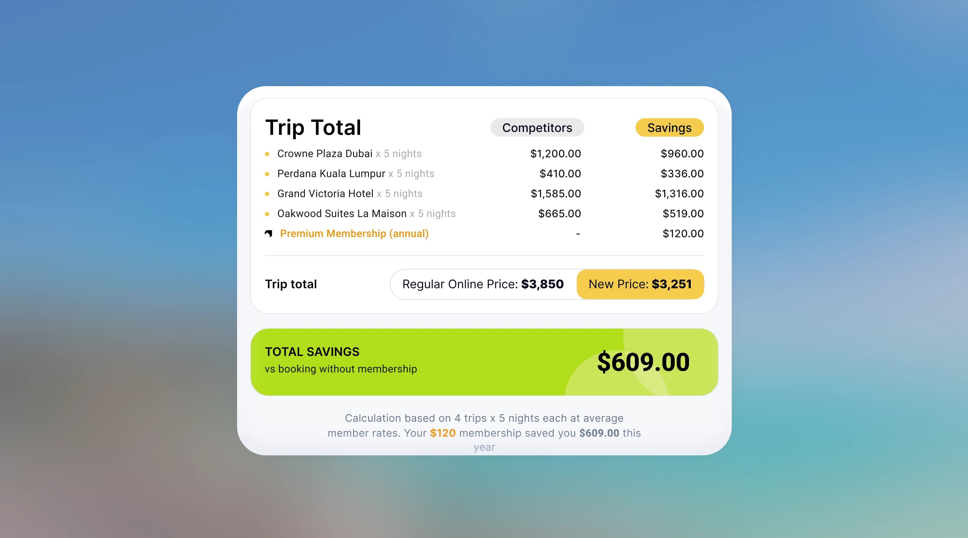
Reframing the subscription as a savings opportunity
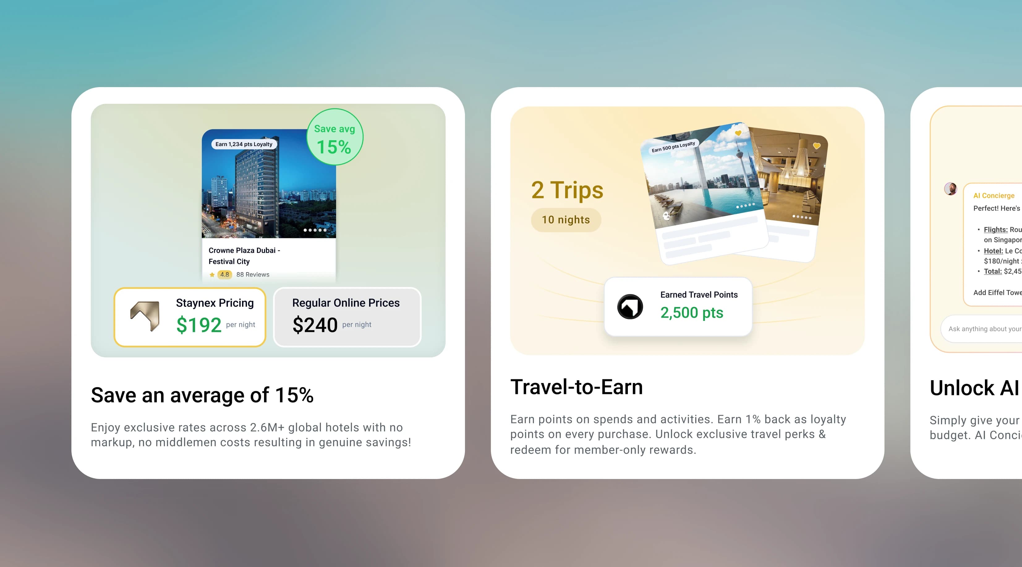
Members now see a concrete 15% saving wherever they browse, at the cost of a little more noise on the home screen.
Throughout the booking UI, I incorporated a hint of the core membership benefit: access to zero-markup pricing. Doing the math on a year's worth of travel shows that booking through Staynex results in an average of 15% in savings for a $120 yearly investment. The phrase “save an average of 15% on bookings” is shown strategically across the non-booking screens to quickly communicate the core proposition.
Other membership benefits are also shown in between booking destinations on the home screen, giving easy access to visitors who might just be browsing.
Key decision 2
Focusing on booking first,
then selling second
Booking stays as clean as the big competitors', while the membership only makes its case at the point it's actually required.
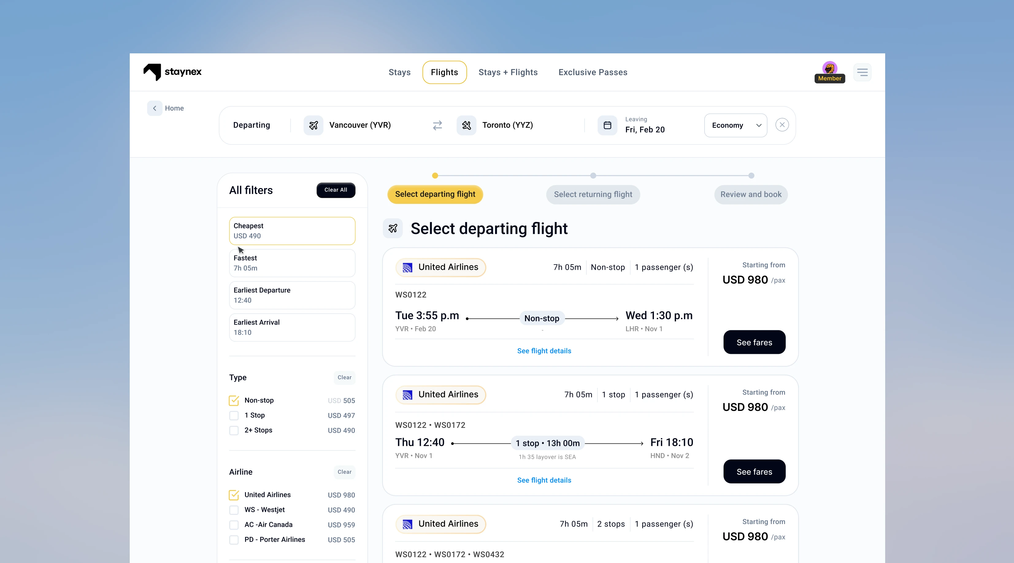
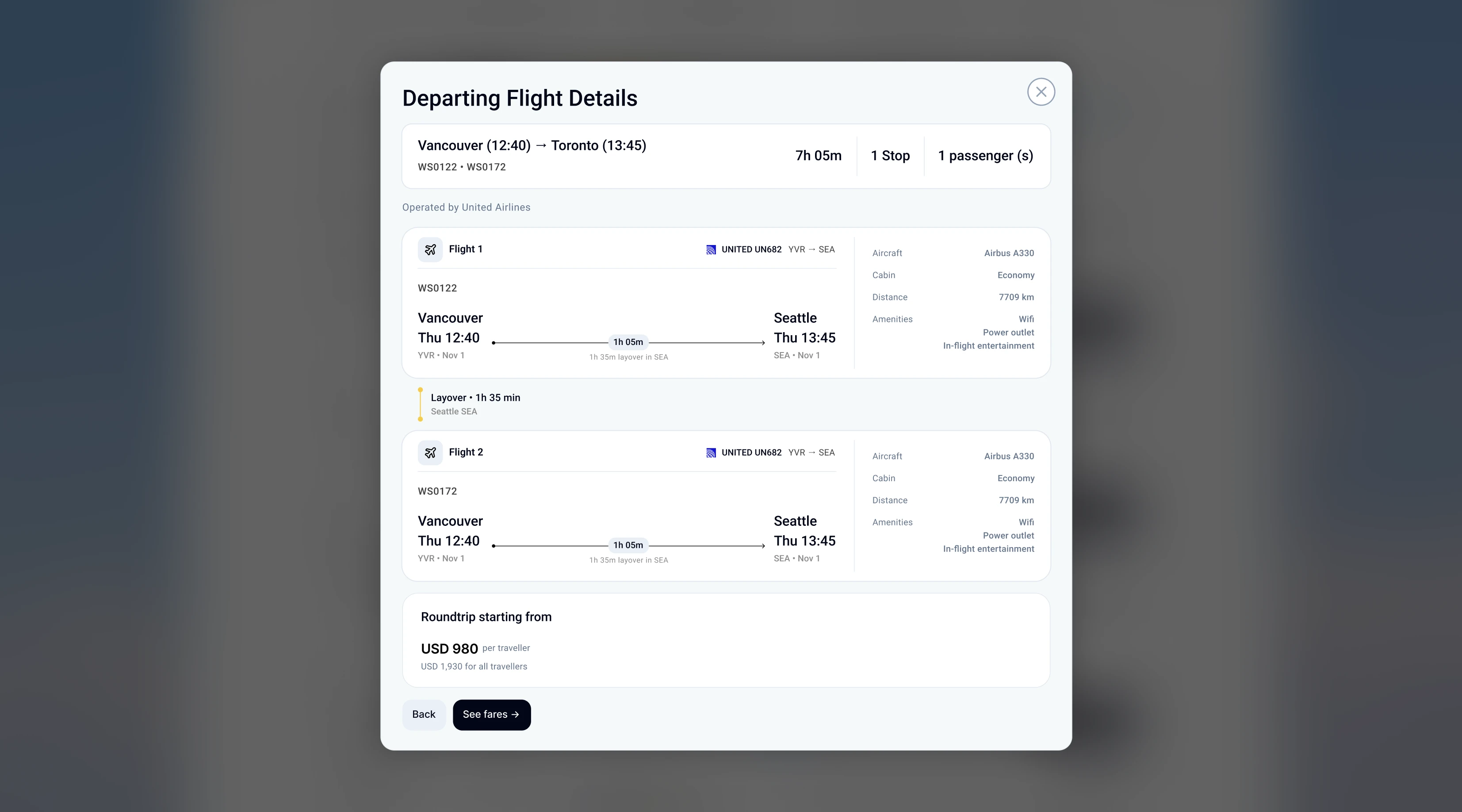
It was very important for Staynex's core booking flows for hotels and flights to be easy, intuitive, and up to par with giant booking competitors. That's why I made sure to keep promotional content away from the core booking flow screens. When a user is engaged in booking, the UI becomes fully focused on making that task as understandable and easy as possible, without any push or promotion toward the membership.
Instead, any flow that required the membership to proceed was met with a popup reminding users that a membership was needed to continue beyond that point.
Key decision 3
Designing for what
could actually ship
A flatter system and front-end notes closed the gap with the build, in exchange for some of the original visual polish.
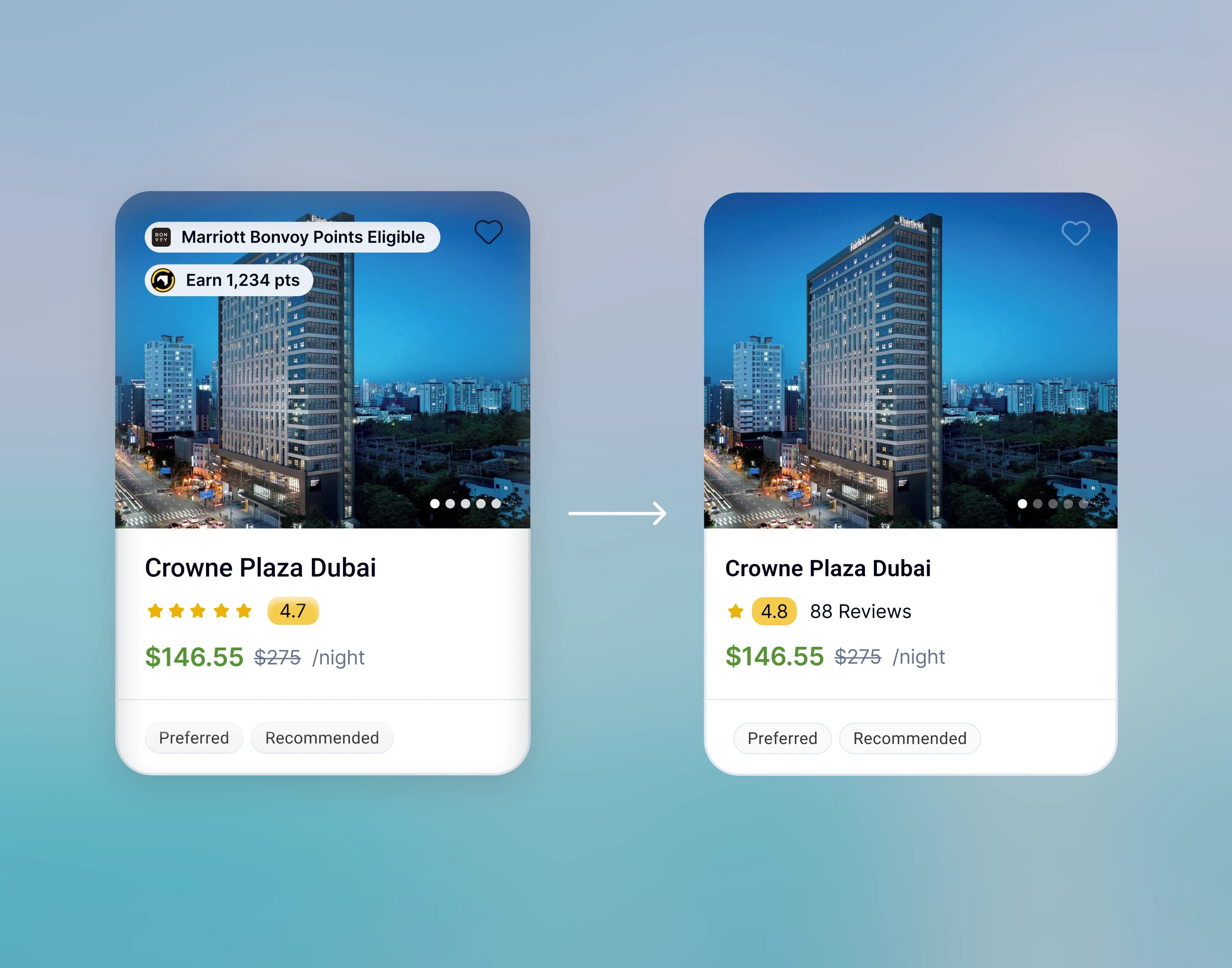
After a few weeks of working, I realized there was a widening gap between my designs and the front end being developed. I had a meeting with the development team, and it turned out the layered gradients and soft shadows in my designs were both slow and difficult for the developers to implement.
As a result, I moved to a simpler, flatter design system with tighter type, simpler alignment and fewer visual effects. After some time, the built results became much closer to the designs I was working on.
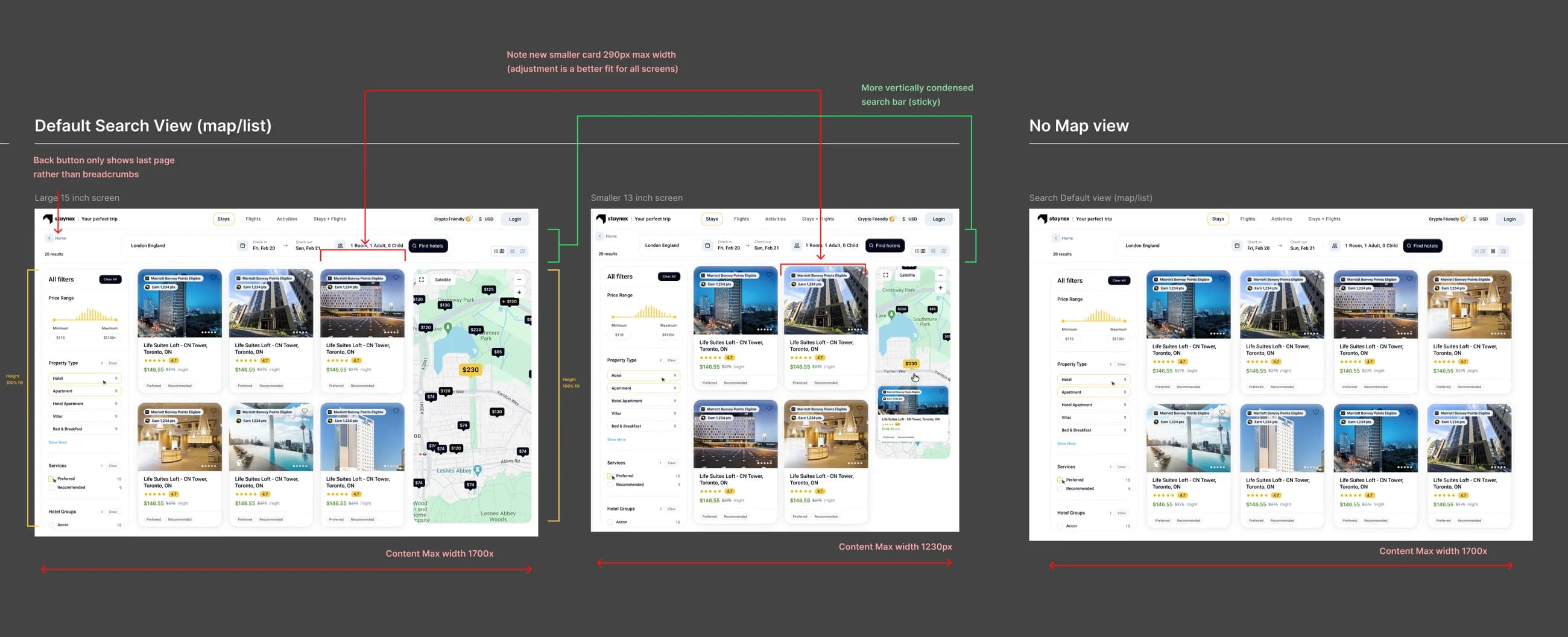
In addition, I wanted to further help the development team, so I started shipping complex screens with front-end notes such as max widths, breakpoint behaviour, and what collapses first. The search results screen in particular was the most demanding, due to its extensive filter UI, map integration, and the fixed-width constraints of the destination cards shown in search results.
The final result
A complete booking platform
Hotels, flights, rewards and an AI planner now live in one consistent UI, though not every feature shipped fully polished.
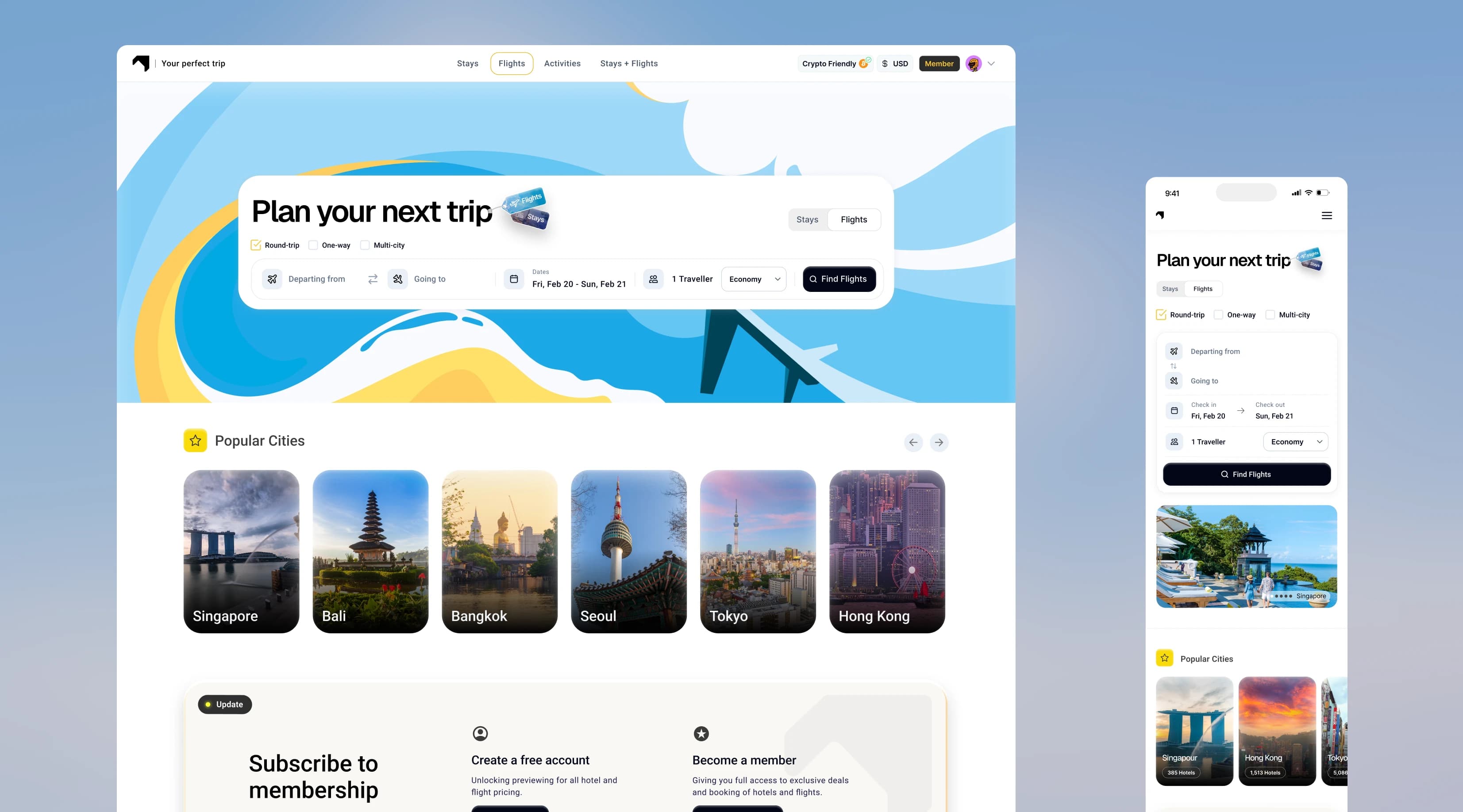
The app now handles flights, booking rewards, token swaps and travel perk purchases, all in one simple, modern UI built on a consistent design system.
Flights arrived after hotels, inside the same search shell, with filters that behave like the ones travellers already know. An AI travel planner, prototyped as a beta preview, lives inside the platform itself, so a member can ask for a plan and book it in the same place.
Mistakes I made
What I would change
looking back
Without a final design check, small deviations reached production. A designer-owned sign-off before launch would have caught them.
Throughout 9 months of shipping, I realized I should have incorporated a post-production loop where engineering would check final results with me before shipping.
As I created the designs, engineering started to lag behind on a different timeline. By the time engineering built a feature, I was already several features ahead, therefore small deviations between the design files and production app quietly slipped through to the live app.
Next time, I would build in a designer-owned final check and refinement before shipping features live.