


OnePay
Mobile app for a smarter way to manage subscriptions

My Role
UX Research
Prototyping
Visual Design
Concept web design
Web development
Project Status
Concept ready for development
Project Duration
04/25 - 05/25

📌 Overview
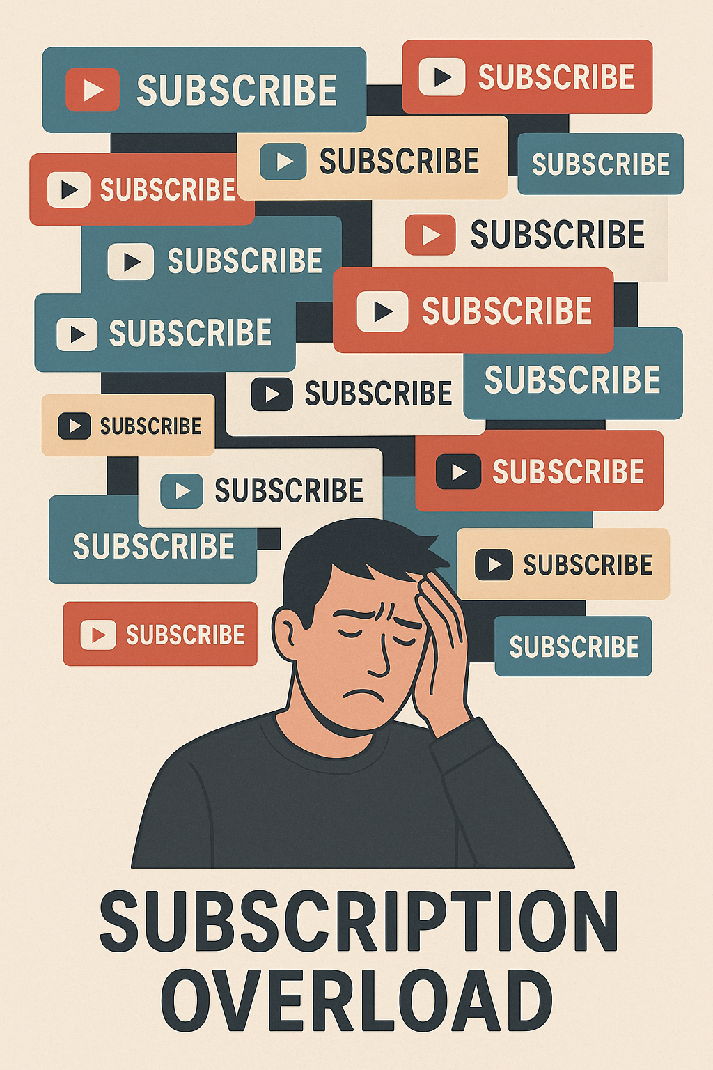
Problem:
Subscription services are convenient but can easily add up. Users don't have clear visibility and control over their active subscriptions leading to "subscription anxiety" and the fear of endlessly paying for services they've forgotten about.
Goal:
Designing a tool the gives users clarity and control over their recurring subscription services.
👤 My Role
I led this project from start to finish as a solo product designer:
Conducted 1-on-1 interviews with 7 users (ages 21-55)
Identified key pain points across user types
Wireframed product journey
Designed high fidelity Figma prototype
Tested Figma prototype with 7 users for UX insights
🔎 Discovery & Research
Interviews:
I conducted 1-on-1 interviews with 7 users in ages between 21-55. I asked about how they manage their subscriptions (Spreadsheets, banking apps, screenshots, notes on phone)
2 distinct personas emerged with similar paint points:
Young adults who juggle multiple subscriptions like streaming, productivity tools, and niche services like gaming. With a more savings oriented mindset, they felt anxiety from accumulating too many recurring costs compounding over time and eating into their savings.
Older adults feared being trapped in subscriptions without being aware of them. Due to a lack of clarity, they are reluctance to subscribing to new services.

😡 User Frustrations
"I don’t even know what I’m paying for anymore."
"I’d cancel, but I don’t know where to do it."
"I don’t want to go through five support tickets just to cancel something I forgot I had."
"Once I subscribe, I feel like I can't get out."
💡 Design Principles
To design a solution, I created the following design principles as a guide:
Transparency: users should clearly understand their total monthly spendings
Control: cancelling or renewing subscription services should be easy and frictionless
Guided information: users should have insights on which areas of life they're delegating monthly spendings to

⚡️ Designed Solution
Onepay offers a clear and easy system to manage all subscriptions with full control to cancel or renew. Key features:
Summary overview: All subscriptions combined to one monthly cost at a glance.
Easy control: cancelling or renewing subscriptions is as simple as flipping a switch.
Intuitive categorization: Subscriptions are categorizes into groups (e.g. entertainment, finance, health, etc).
Behaviour nudge: With more insights on monthly spendings, users can be more intentional in choosing the monthly services they truly need.

💡 Key Design Decisions
Dashboard Overview
Total monthly recurring cost
Grouped categories for subscriptions
Clear upcoming charges

Cancel/Renew toggle
Giving users total control over renewals
Cancelling does not require being tech savvy
Clear upcoming charges

Useful notifications
User notified about upcoming renewals. No more surprise charges
Warning about free trials ending
Transparency on pricing changes

✍️ Design Phase
Wireframing
I began with ultra-low-fidelity wireframes to map out the core user flow:
onboarding → adding subscriptions → reviewing spend → editing/canceling. These grey-only, text-based screens allowed me to quickly define structure without any design distractions.
.webp)
Establishing visual design:
Once I had the main flow figured out, I started collection other designs for inspiration.
I looked at many bookmarked designs from X (twitter) and Dribbbles. I accumulated these designs into a mood board and distilled key elements I felt aligned with OnePay's brand: calm, clear, playful, confident.


High fidelity design:
I tackled designing the most complex screen from the app, the home screen. Focusing on font, colours, container details, shadows, and overall visual feel.
Once I felt happy with the home screen, I extracted an early visual design system which was used to design the rest of the screens for onboarding.

Prototype
With the screen designs finished, I started linking the flow of the screens on Figma.
During prototyping, I created a few more screens I realized were needed while linking the app screens together. These were extra settings such as editing subscription categories or deleting subscriptions entirely.
Once completed, I spent some time working on the prototype transition animations.
Try Prototype

✍️ Final Design


🏅 Results & Outcome
User testing with my key users revealed emotional impacts of OnePay's core concept:
Feeling relief: Testers felt a sense of relief from having all the subscriptions under one number. Some felt the number wasn't as big as they originally thought.
Appreciating more control: Testers loved how easily subscriptions can be toggle off. Even if they didn't want to cancel any subcriptions, they appreciated the easy option being these just in case.
categorization insightful: Some testers were surprised how much they spent on entertainment. They found the categorizations insightful in uncovering which areas of life they're prioritizing with their spendings.